Monday, December 7, 2009


j. howard miller 1940s
this would be a form of slogan propaganda since the main idea for the poster is contained within a slogan supporting this main idea. it draws attention to the cause behind the poster, of women being a new part of the workforce.


campaign poster, 1964
this is clearly an example of slogan propaganda since the phrase "all the way with lbj" is short, easy to remember and makes a lot of people familiar with you, your idea, or your product.

Wednesday, November 4, 2009


kolomon moser, art nouveau poster
stanley mouse, 678 show poster


jules cheret, vin mariani
stanley mouse, grateful dead poster


leonetto cappiello, porto pitters poster
rick griffin, joint show poster july 17 1967

Wednesday, October 28, 2009


edward wadsworth, street singers, 1914
this image is highly influenced by the movement, using abstract forms and cool, muted tones. this piece however is less busy then most others, leaving space around the figures drawing more attention to them and not around the page.


edward wadsworth, abstract compostition, 1915
this image greatly references cubist and futurist works, especially in the way the shapes overlap and meld together. this color palette is very similar to other vorticist works but also adds colors that can be seen in cubist works, the blues and greens. the shapes are drawing the viewers eye around the page and right to the middle of the work, which was a major factor in the vorticist movement.


edward wadsworth, dazzle ships in drydock at liverpool, 1919
this image uses geometric shapes indicative of cubism, which vorticism stems from and uses as an influence. in this image wadsworth includes a little bit of the palette seen in other vorticist works, bright oranges and reds, but also strays from that in his muted grays and tans. this image also includes a recognizable from which is not seen often in other vorticist works, but it is done a little later and is mostly just influenced by his involvement in the vorticist movement.

Sunday, October 18, 2009


silence 1915 by Georges Ribemont-Dessaignes dada, paris. he was not only a dada artist but also contributed to literature involved with the movement. this piece interested me due to its mechanized look. the piece has a lot of movement due to the fact that the images depicted are those of moving objects and therefore contributes to the motion that can be found in the work. the palette consists of a very nice contrasting balance between the blues and the orange and yellow.

Tuesday, October 13, 2009


xmen
this graffiti group was located in brooklyn and not only consisted of writers, but also rappers, djs, break dancers and roller skaters. i enjoy their style due to the vivid colors in some of the pieces. this helps to give the letters some life and really helps them pop out at the viewer because of the contrast against a mash-up of other graffiti and grey walls. the use of different colored spots in some of the letters help to add a sense of texture to an otherwise 2-d surface.


laszlo mahogy-nagy, bauhaus, he was very influenced by what was happening during his time, in an attempt to meld industry and technology into the arts.
this piece has a good sense of rhythm and balance. the lines help to move you around the image. the palette keeps the the image balanced instead of letting the geometric blob of shapes take over.

Sunday, October 4, 2009


Stefan Sagmeister, flyer for biennial conference in new orleans, 1997
this image captured my attention mainly because of the placement of the text. i enjoy the different fonts, sizes and placement. it creates a lot of movement which aids the images of chickens running. i also enjoy the muted tones in the ground.


Hannah Hoch, Dada, Marlene I, 1930
Hannah Hoch belonged to the first wave of feminists artist and much of her art addresses social stereotypes of women.
i find this piece compelling because she was challenging the social norms by becoming a woman artist, working in a nontraditional material and made art directly challenging the social oppression of women. her artwork is reminiscent of abstract expressionism, and compliments her use of abstract collage images.

Sunday, September 27, 2009


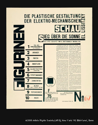
el lissitsky
The connecting circle in the image create a sense of motion which leads the viewer around the page. The contrast within the image makes the image more visually appealing.


el lissitsky Page from program for Victory over the Sun 1923
This design has very little depth due to only being done in text and in black and white. Although the text is not uniform and is in different sizes the image is still balanced.

Sunday, September 13, 2009


this image shows a lot of tension by overlaying objects and colors, making them meld into each other and not being able to distinguish one from the other, or at least the edges of the objects. it has a lot of motion due to the change in angles of the people and where they are looking. has a lot of contrast between the cool and warm palettes.


this poster is by Saul Bass. this image is very flat due to the lack of objects on the page and the amount of contrast that can be seen, using only shades of gray and red for some of the text. it uses minimal color change and objects.


this poster is by Bemis Balkind. the left and right sides of this image are very balanced visually, with equal attention being payed to the objects and their apparent weight. it shows depth by layering objects and by differentiating the scale between the objects, also by changing the way the lights interacts with the objects.


this was designed by Ian Pettigrew. this poster shows depth by placein someone in front of a cityscape that appears to be far off in the distance due to the relationship of scale between the two objects. this picture has many differences in texture ranging from the smoothness of the smoke to the hard, rough ground to the scratchiness of the stubble on the mans face.